After giving the iPhone lock screen all the love last year, Apple has finally turned its attention to the iPad with iPadOS 17’s redesigned lock screen. The iPad has been experiencing an identity crisis over the last two years, trying to find its place in an era where the Mac is getting more refined and the iPad is becoming more Mac-like.
Although Apple made noise last year with Stage Manager, the iPad still needed a clearer focus on its purpose. In my opinion, iPadOS 17 changes that. If you’ve used the iOS 16 lock screen, the iPad’s redesigned interface will feel instantly familiar, but it’s far from the same.
The Good News
As I pointed out on Twitter before Monday’s WWDC 2023 keynote, Apple typically ships something on one platform first, refines it, tweaks it, and then expands it to the rest of its family a year or so later. A good example is App Library, which was introduced three years ago with iOS 14 and reached the iPad with iPadOS 15. Similarly, iPadOS 17 follows a similar pattern.

Discover new horizons, always connected with eSIM
Travel the world stress and hassle-free with the best eSIM service available. Enjoy unlimited data, 5G speeds, and global coverage for affordable prices with Holafly. And, enjoy an exclusive 5% discount.
Some time has passed since I started using iPadOS 17’s first developer beta. Let me begin by sighing with relief. Going into this year’s WWDC, I was worried Apple would repeat what it’s done with App Library on iPadOS 17: take an iPhone experience and stretch it out to iPad size (shout-out to the 15-inch MacBook Air reveal for visualizing this so well).

The iPadOS App Library feels like a copy of the iPhone’s, and that’s not to say it doesn’t work, but it missed an opportunity to do something innovative with how apps are organized and interfaced. As for the lock screen, Apple could have used the same widgets, placement, wallpapers, and options from the iPhone and tossed them onto the iPad. This would have been appreciated, but Apple’s failure to capitalize on the iPad’s larger screen would have been equally concerning.
With iPadOS 17, the lock screen offers the same customization features as the iPhone: changing the time’s font and typography weight, adding widgets, and, of course, changing the wallpaper. Nevertheless, every aspect of the iPad lock screen has been carefully rethought with iPadOS 17.
Widgets and Live Activities
iPhone widgets can be placed below the clock (in addition to one above it), with a maximum of four small widgets, two large widgets, or two small and one large widget. The iPad offers two widget modes: portrait and landscape modes. In portrait mode, the new lock screen is like a mega-sized iOS 16 lock screen resized for iPad. You’re limited to the same number of small and large widgets beneath the clock.

Turning the iPad into landscape is when things get interesting. As soon as you do, Apple (thankfully) decides to take full advantage of the unused iPad screen real estate. There is now the option to add widgets to a column on the left side of the screen in landscape. It’s heavily reminiscent of iPadOS 14 when widgets were pinned to the left side of the home screen rather than living among apps.
One column holds varying sizes of widgets: small, medium, and large. The small and medium options are the same as those on the iPhone’s lock screen and the iPad’s portrait mode. In essence, the new large option is two medium widgets stacked on top of each other. The column can accommodate quite a few widgets. Using my fifth-generation iPad Air, I can fit five medium widgets, two small widgets, and one large widget. An iPad with a larger screen, such as the 12.9-inch iPad Pro, will be more versatile.

It isn’t perfect, however. iPadOS 17 and iOS 17 support interactive widgets on the home screen, but they don’t work on the lock screen. When you tap the Home widget, for instance, the Home app opens instead of letting you adjust accessories on the lock screen. Technically, I could see the arguments against such levels of control. It makes sense, though, that I should be able to easily toggle and control different items from my iPad’s lock screen when it is unlocked.
It’s still early, but the widget column with iPadOS 17’s lock screen is one of the most underrated announcements from WWDC 2023. It’s precisely the type of addition I was hoping for to make the iPad feel more like a hub, offering timely information directly on the lock screen when it’s on my desk without the need to open it. Not to mention, Live Activities are now on the iPad. Like the iPhone, they appear prominently above notifications on the iPad’s lock screen interface. Multiple timers are now supported in iOS 17 and iPadOS 17.
Wallpapers and Home Screen
iPadOS 17 features wallpapers fundamentally the same as iPhone’s but with a few thoughtful additions. Apple has brought back the original iPad wallpaper used on the first-generation iPad. Reformatted in higher quality, the updated wallpaper now looks crisp and is now animated. Despite its subtlety, the animation adds a nice touch.
Similarly, Apple’s Astronomy collection (which now includes all planets) has the same animations for the iPhone and iPad, which look great on the larger screen. A new Hello wallpaper is also available with 12 different background color options in the first beta. Depth is also supported for wallpapers in iPadOS 17. Although it mirrors the iPhone’s limitation in portrait mode, enabling depth for a wallpaper doesn’t prevent you from adding widgets when in landscape on iPadOS 17.
Live Wallpapers

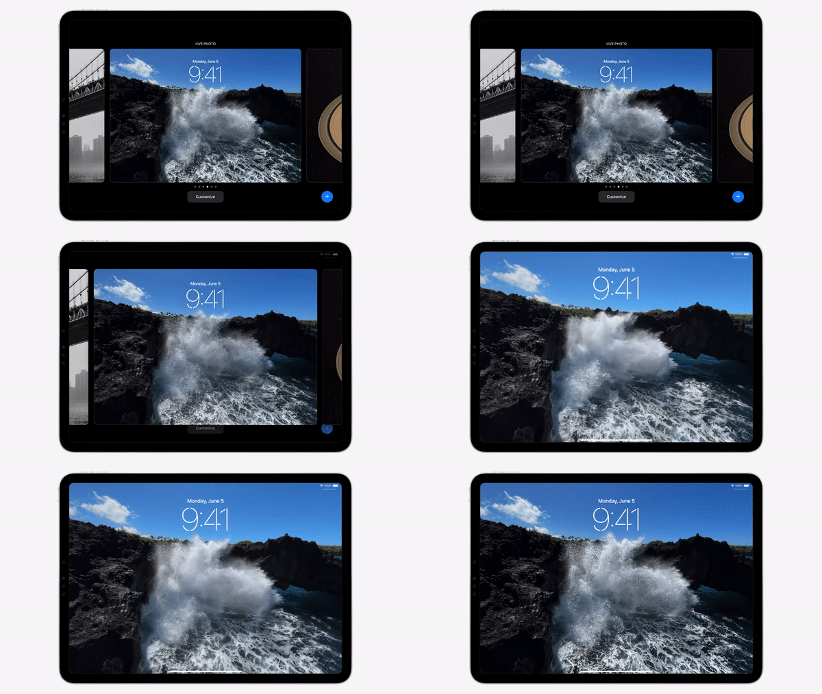
In iOS 17 and iPadOS 17, Apple is bringing back Live Photos to the lock screen. With Live Photos, you can set your device’s wallpaper to automatically play a Live Photo every time you open it. Live Photos still offer all the usual customization options, such as widgets on both iPhones and iPads and changing the font and color of the time. Obviously, Live Photos are muted when used as your wallpaper. If you don’t want the Live Photo to animate, you can disable it and treat it like a still photo.
Wrap Up
As part of iPadOS 17, a host of refinements have been made, including many changes to Stage Manager that give the user more control over the placement of app windows. Until iPadOS 17 is officially released in the fall, I will reserve my final thoughts. In the meantime, I look forward to sharing my observations over on Twitter as iOS 17, iPadOS 17, watchOS 10, and macOS Sonoma are in beta testing over the summer.


