Apple’s visionOS is the company’s newest operating system that powers Vision Pro. The design language of visionOS is unmistakenly Apple-like everywhere you look, yet with a deliberate twist that morphs it into a modern mixed-reality platform. Could this design be heading to iOS 18?
The most striking design feature of visionOS is the heavy use of translucent panes and windows, blurring the line between light and dark modes. This choice makes perfect sense on a device like Vision Pro that makes its user interface blend with the wearer’s surroundings, whether it’s a dimly lit room or a bright visionOS Environment like Mount Hood or Beach.
The translucent elements coupled with the heavy use of shadows and floating navigation bars make for a 3D effect that amplifies the spatial experience of Vision Pro, further immersing its wearer.

Discover new horizons, always connected with eSIM
Travel the world stress and hassle-free with the best eSIM service available. Enjoy unlimited data, 5G speeds, and global coverage for affordable prices with Holafly. And, enjoy an exclusive 5% discount.
Ever thought about what iOS 18 might look like if it adopted the look and feel of visionOS? Look no further than a new set of concepts designed by @upintheozone on X. Thanks to their work, we now have a general idea of what iOS 18 could look like should Apple expand this design language beyond visionOS.
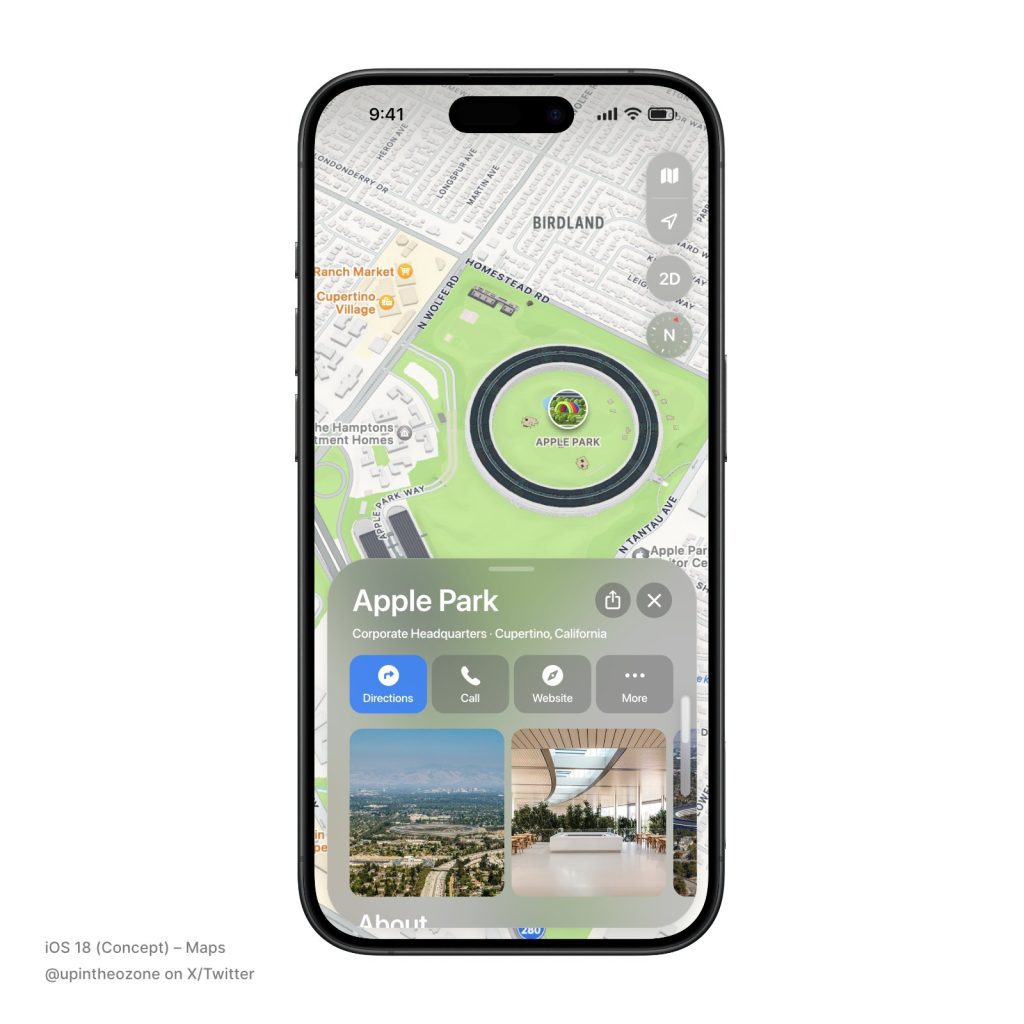
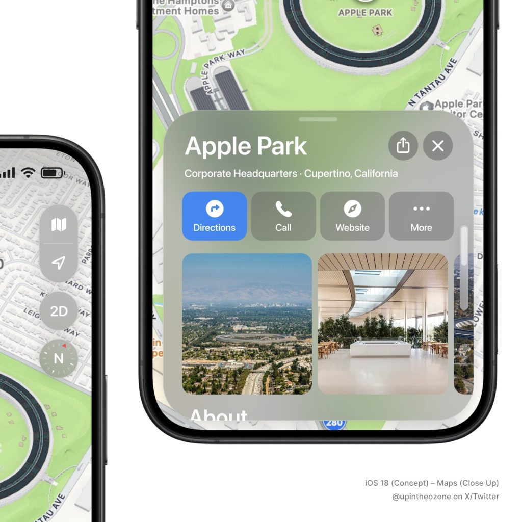
The concepts reimagine popular Apple apps in a fresh visionOS-like coat of paint as part of iOS 18. Take Maps for example, now adorned with translucent elements that float in front of content for a more persistent sense of depth and hierarchy. The corner radius on elements like panels and buttons is much rounder than before, matching the radius of the iPhone’s display.
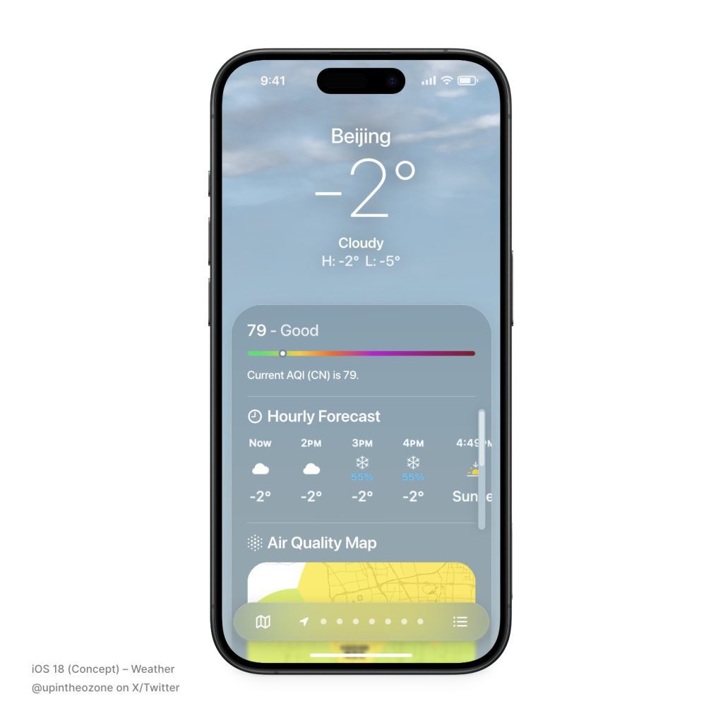
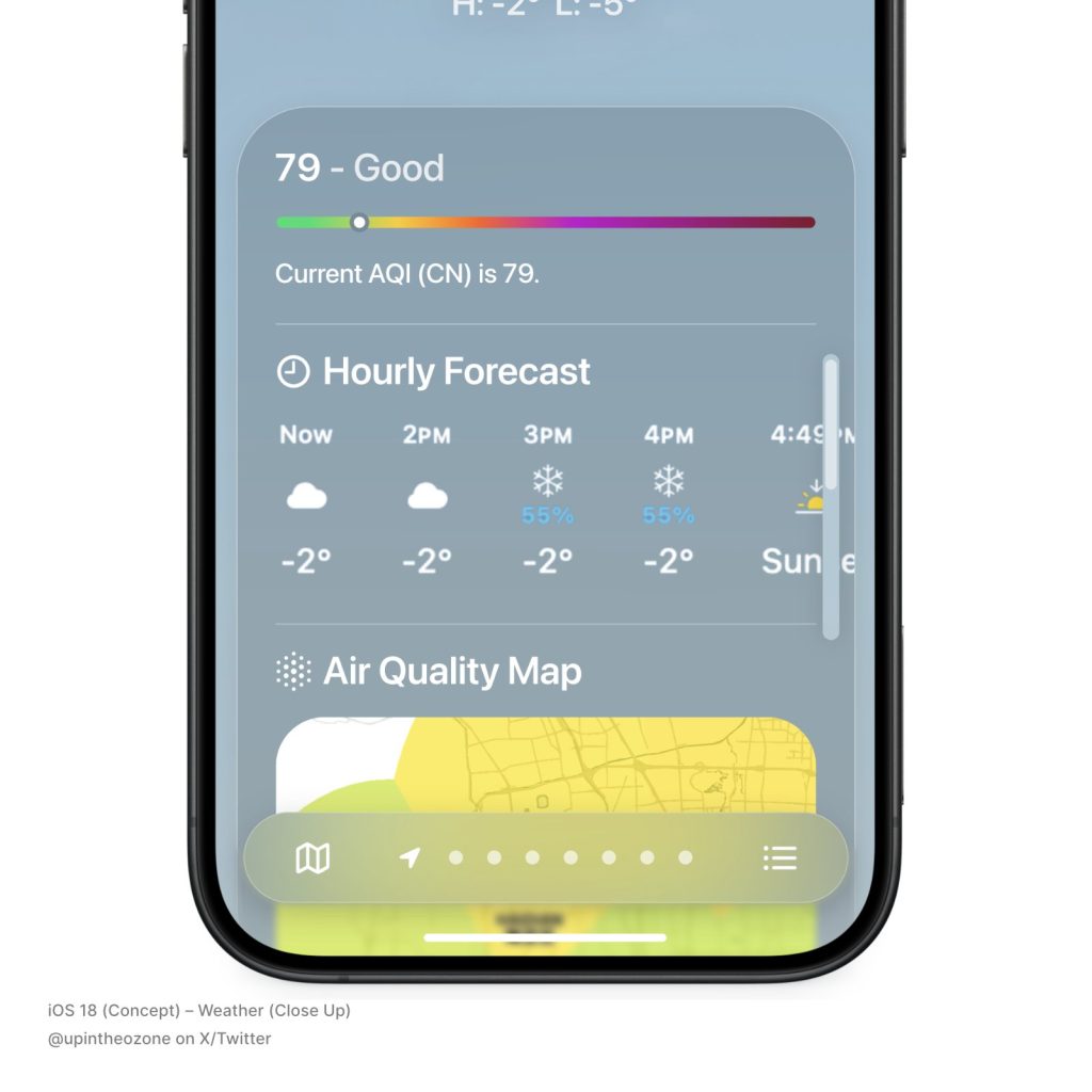
Weather features a tweaked design with a rounder and uniform panel that combines multiple data points into a singular window. The bottom navigation bar to cycle between multiple locations is now completely detached, floating in front of weather information with a premium glass-like effect.
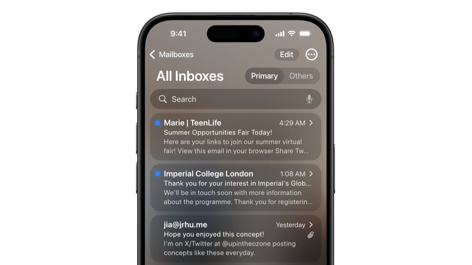
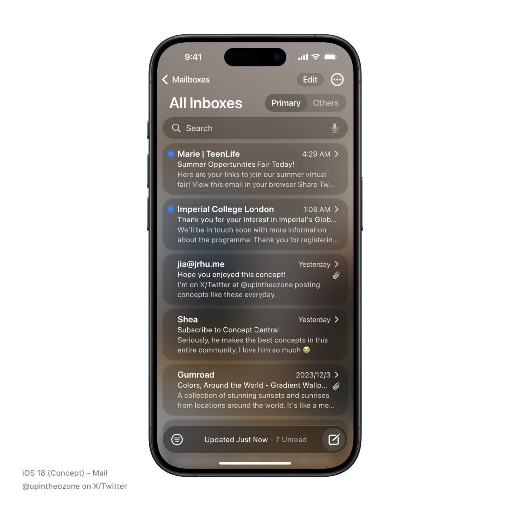
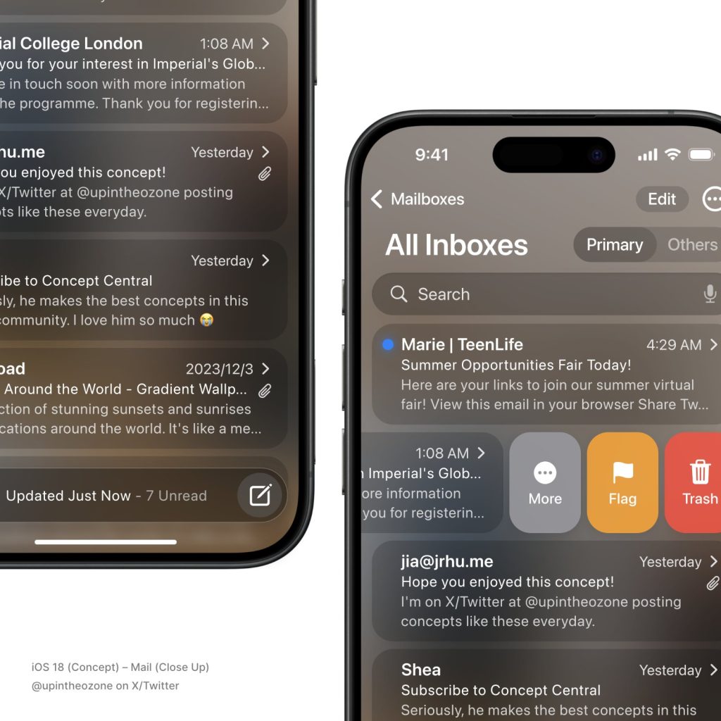
Mail receives a complete overhaul as part of this concept. The rethought app does away with the static black and white backgrounds, replacing them with a blur of the Home Screen wallpaper. The search bar and buttons are pronounced with distinct and rounded borders, with each individual email encompassed in its own separate item list. Filter and Compose buttons are overlayed in the now-floating navigation bar just like Weather.
While Apple may not adopt this design language for the upcoming major release of iOS, if ever, iOS 18 is still said to be an “ambitious and compelling” update. Whether that includes a major redesign remains to be seen, but the company might spice things up for its most popular operating system which has looked relatively unchanged since iOS 7 brought forward a groundbreaking overhaul more than a decade ago.


