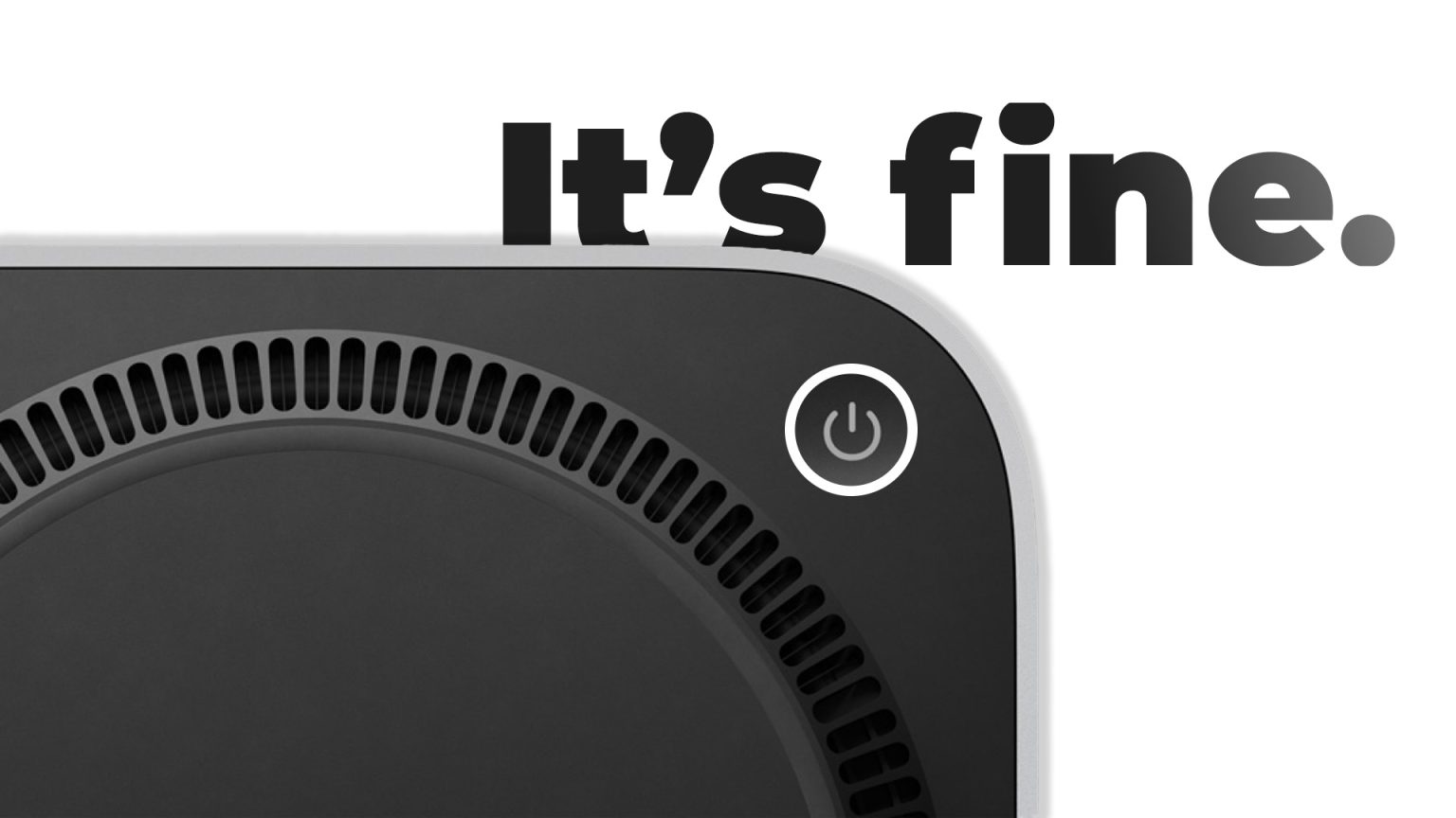
In a new interview, two of Apple’s two most senior executives have defended the “controversial” placement of the Mac mini power button on the newly redesigned smallest Mac. The new Mac mini features a significantly smaller footprint than its predecessor, and part of the design change is the placement of the power button on the bottom of the computer.
The placement of the button has reminded some people online of the decade-old running joke of the Magic Mouse, which has its Lightning (now USB-C) charging port on the back, making it impossible to use while charging. The placement of the button on the Mac has mystified some people online, while seemingly not realizing that the power button on Macs rarely gets used.
In an interview with an influencer last week, Apple’s Senior Vice President of Worldwide Marketing, Greg Joswiak, and Apple’s Senior Vice President of Hardware Engineering, John TernusJohn Ternus has been Apple's COO since 2009. More, addressed the design choice, saying no one uses their Mac’s power button.
It’s the kind of optimal spot for a power button. Just kinda tuck your finger in there and hit the button, it’s easy to spot. And honestly, the most important thing is you pretty much never use the power button on your Mac. I don’t even know the last time I think about turning on a Mac.
The Mac mini features a much smaller design than its predecessor, which Apple says measures around 5 inches by 5 inches. The M4 chip allows the all-new Mac mini to be up to 1.8x faster in CPU tasks and 2.2x faster in GPU performance than the M1 model. There are now two USB-C ports on the Mac mini’s front for the first time, with three Thunderbolt 5 ports on the back of the M4 Pro configuration. The Mac mini can be configured with either the M4 or M4 Pro chip and starts at $599.


